Bevera
Background
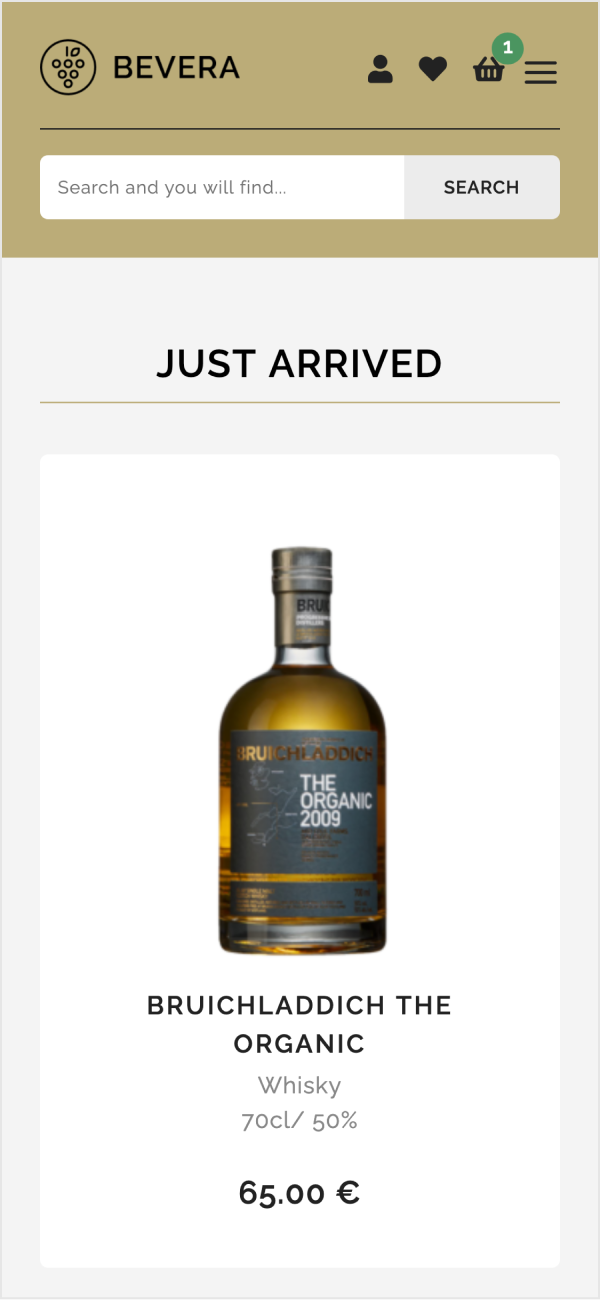
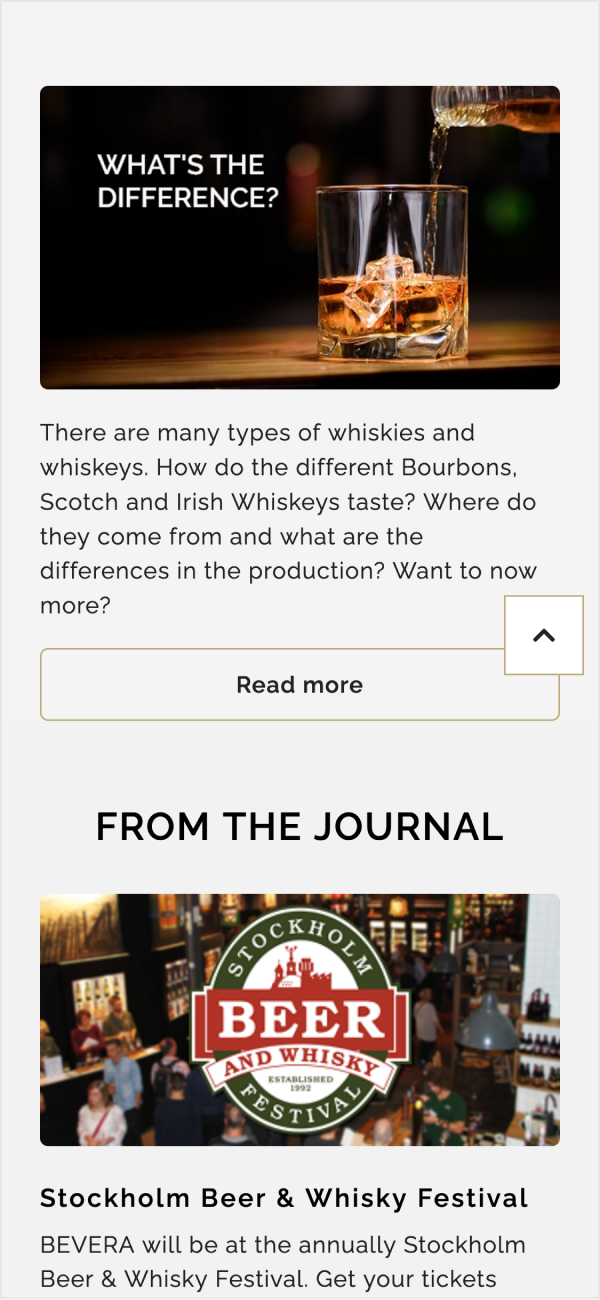
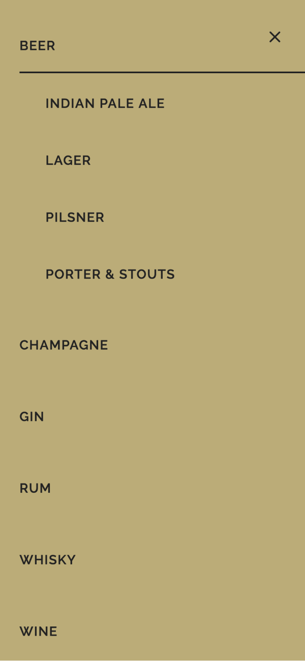
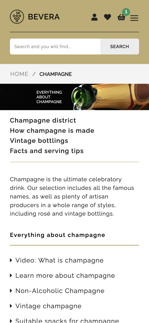
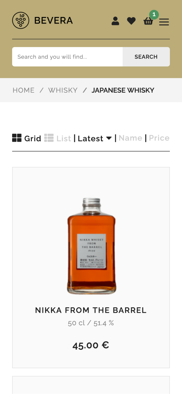
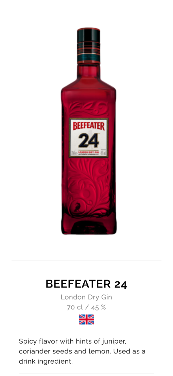
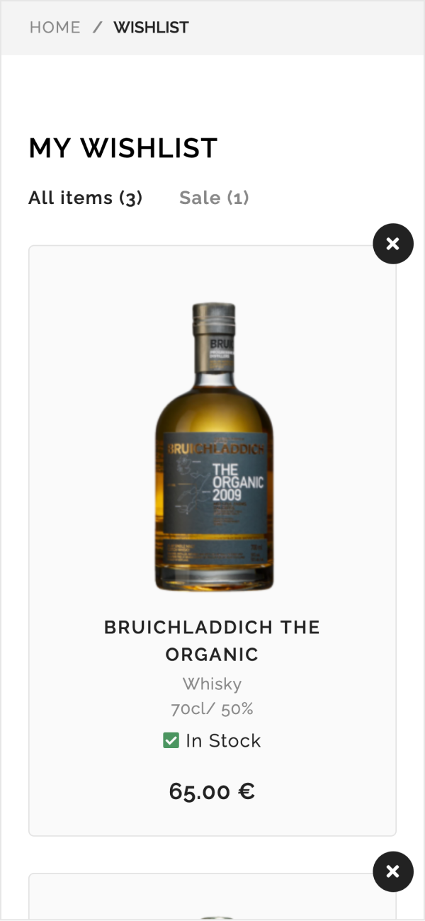
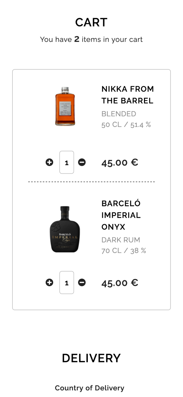
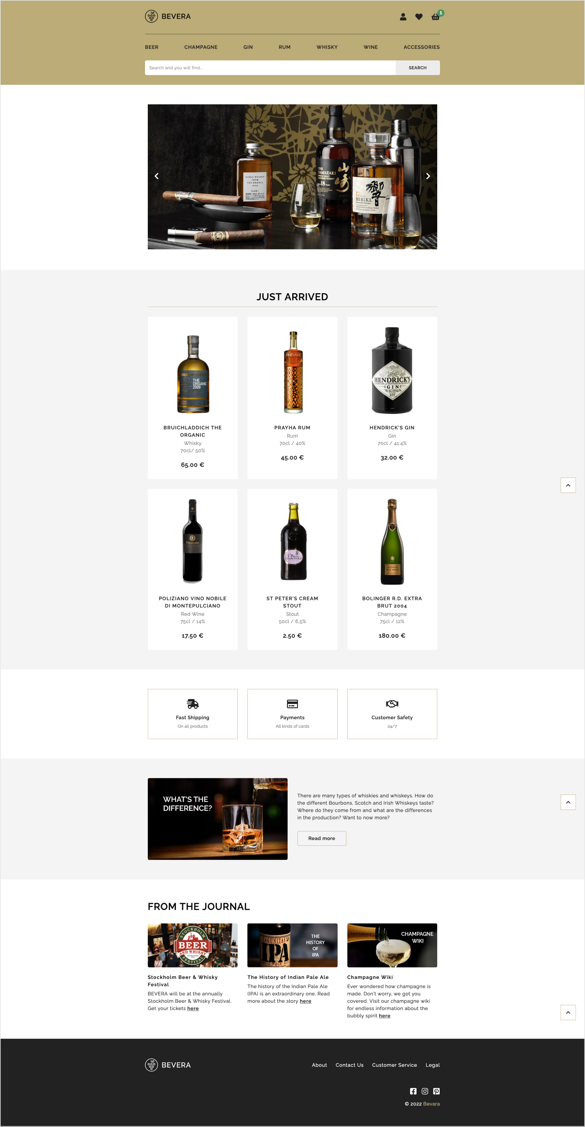
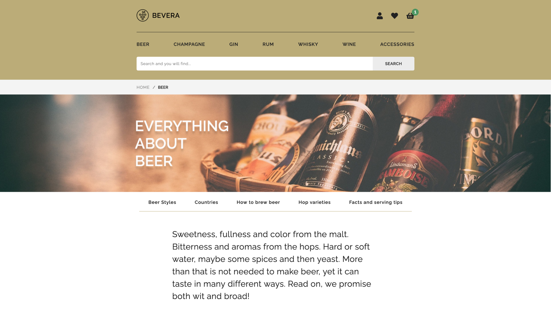
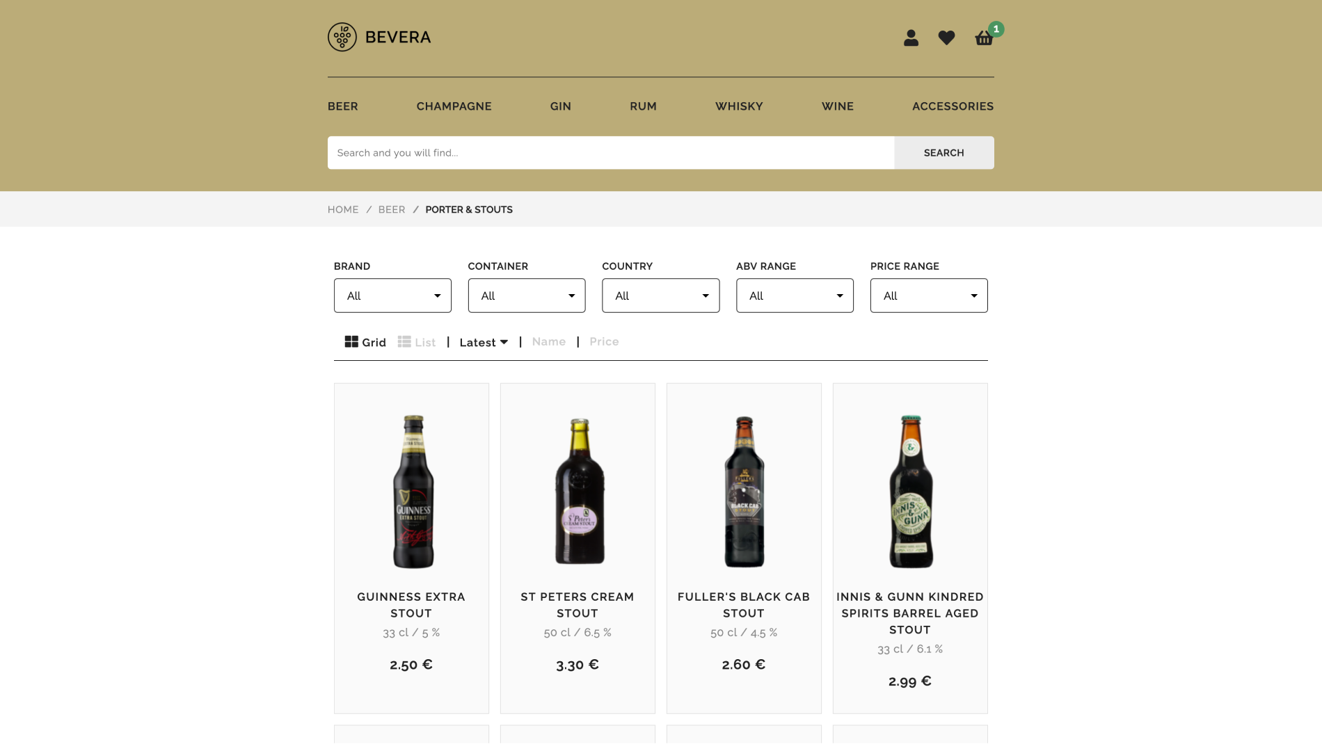
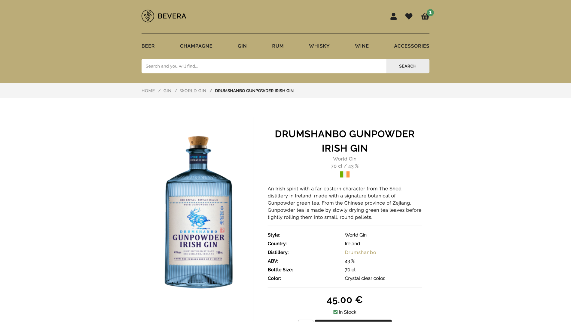
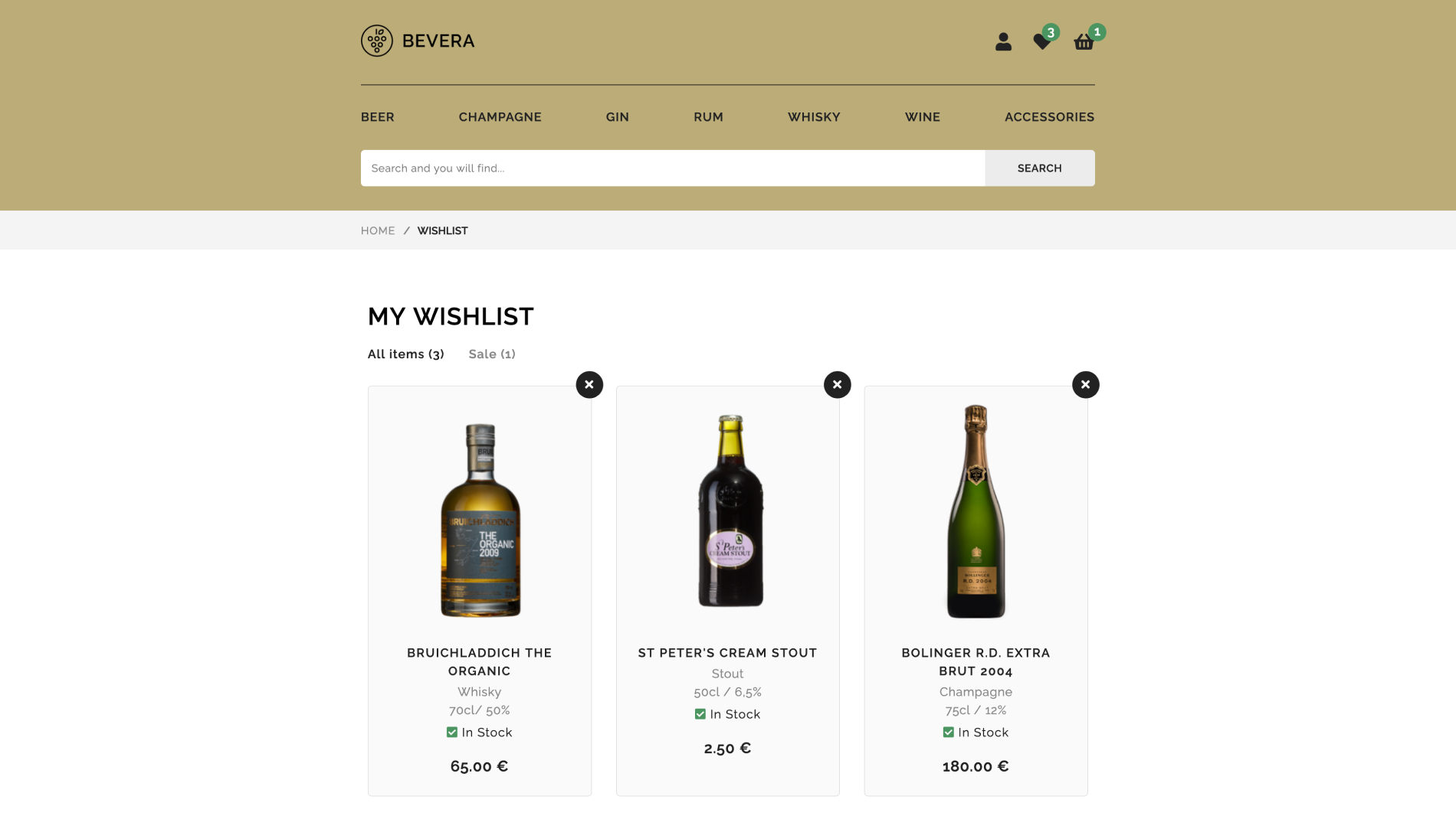
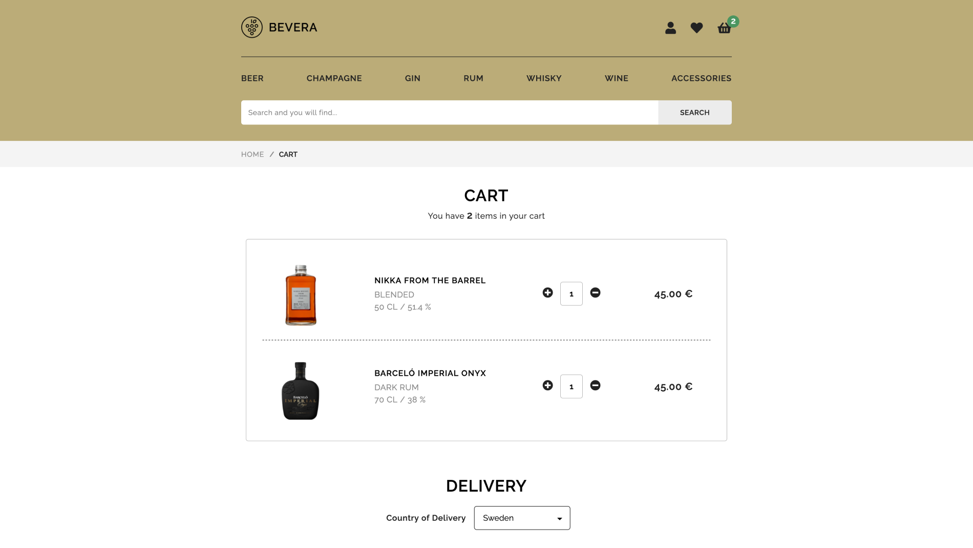
Bevera is a concept online shop that sells alcoholic beverages online which I created during my first year as a systems science student. The website acts as a good starting template for modern e-Commerce sites by incorporating a sleek design with the use of a fresh color palette, good typography, useful navigation, and high-quality images.
Identity design
The logotype comes in two colors, black and white.

The color palette uses a strong shade of gold color as its brand color. Additional colors are a balanced mix of neutral base colors and functional accent colors that signals a clear message to the user.
The typographic system is using the font of Raleway which is an elegant typeface. It is a display face and features both old style and lining numerals, as well as a stylistic alternate inspired by geometric sans-serif typefaces.
Headline
abcdefghijklmnopqrstuvwxyz
abcdefghijklmnopqrstuvwxyz
1234567890!@#$&^&*[)
Body
abcdefghijklmnopqrstuvwxyz
abcdefghijklmnopqrstuvwxyz
1234567890!@#$&^&*[)


