Scana
Background
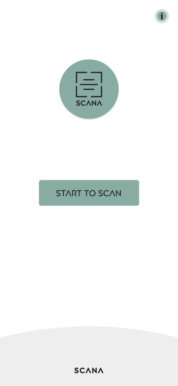
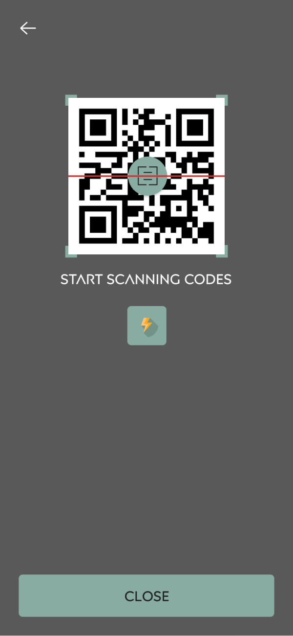
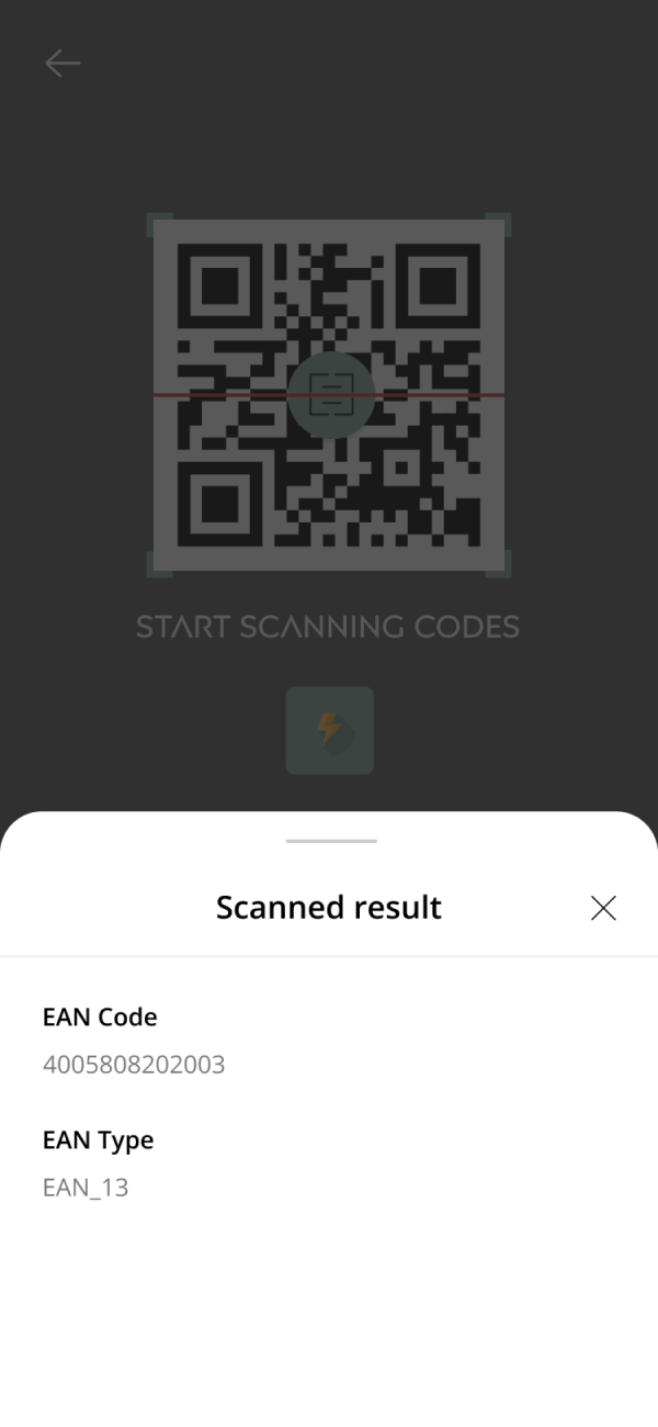
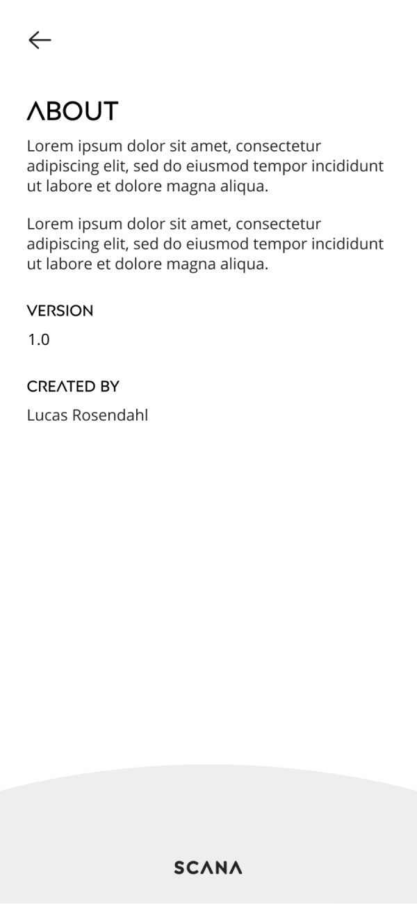
Scana is mobile application that offers code scanning for both iOS and Android devices. The application offers a modern sleek user interface design with a fresh green color palette with subtle hints of grey, black and white colors.
Scana was initially created as a case collaboration between a known IT company in Borlänge, SE and a group of students (including me) for a course I enrolled in called "Systems Development on the Internet/Intranet". The project was created during my final year and the assignment was to create an early prototype of a scanning application.
Furthermore, the shown application here is a stripped version of the original and only highlights certain parts of the mobile application.
Identity design
The logotype comes in two colors, black and white.
The color palette uses a dark green color as its brand color. Additional colors are a balanced mix of neutral base colors, including different shades of grey.
The typographic system consists of two fonts; Posterama 2001 and Open Sans. These two typefaces are used for different purposes. Posterama is used for headings while Open Sans is targeted towards body text.
Headline
abcdefghijklmnopqrstuvwxyz
1234567890!@#$&^&*[)
Body
abcdefghijklmnopqrstuvwxyz
abcdefghijklmnopqrstuvwxyz
1234567890!@#$&^&*[)


