Back
Geosty
A location-based weather app focused on clarity and simplicity.

01
Context
Overview
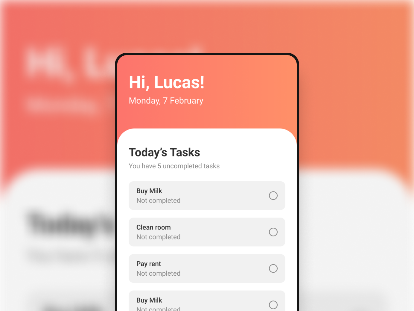
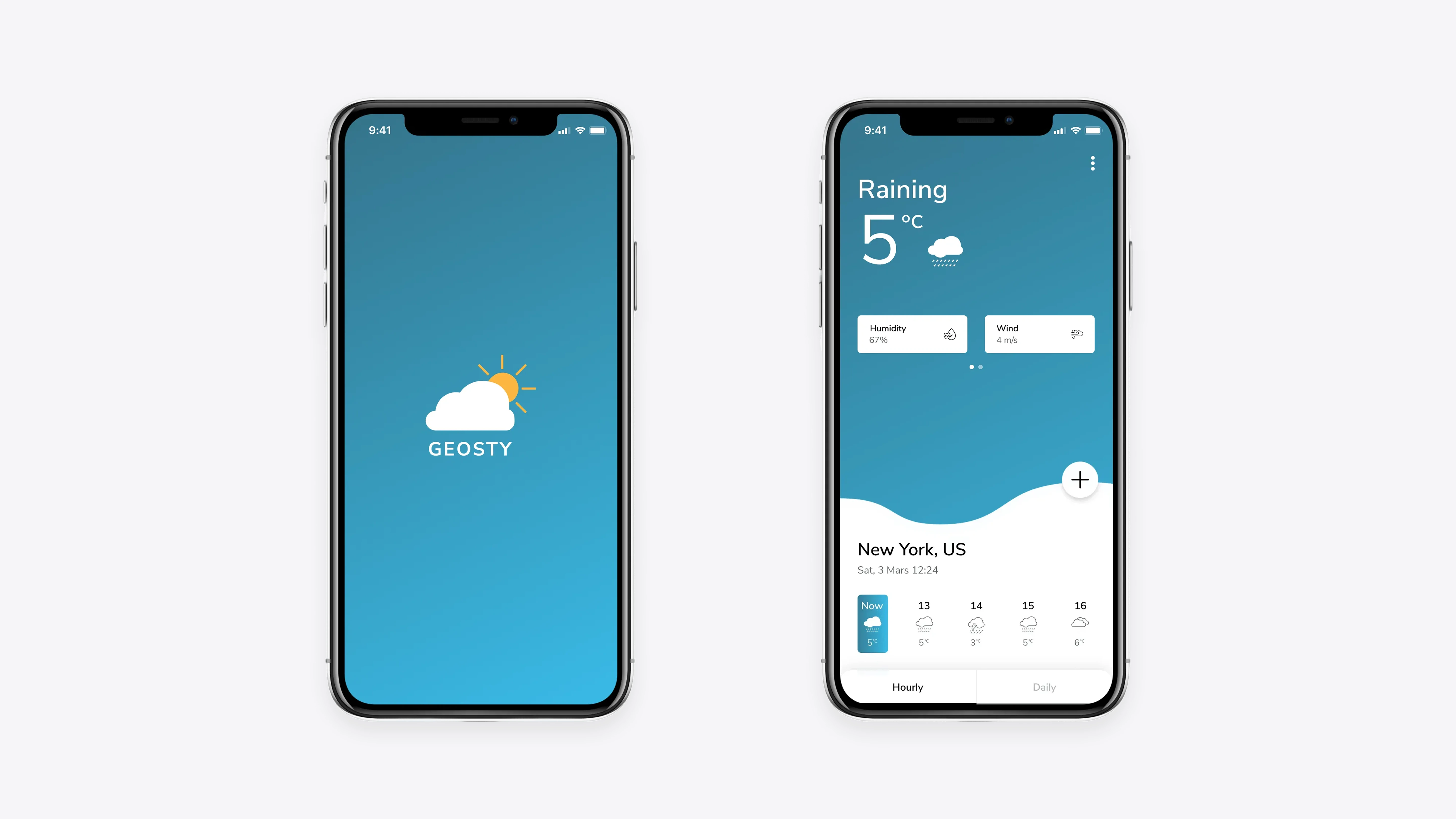
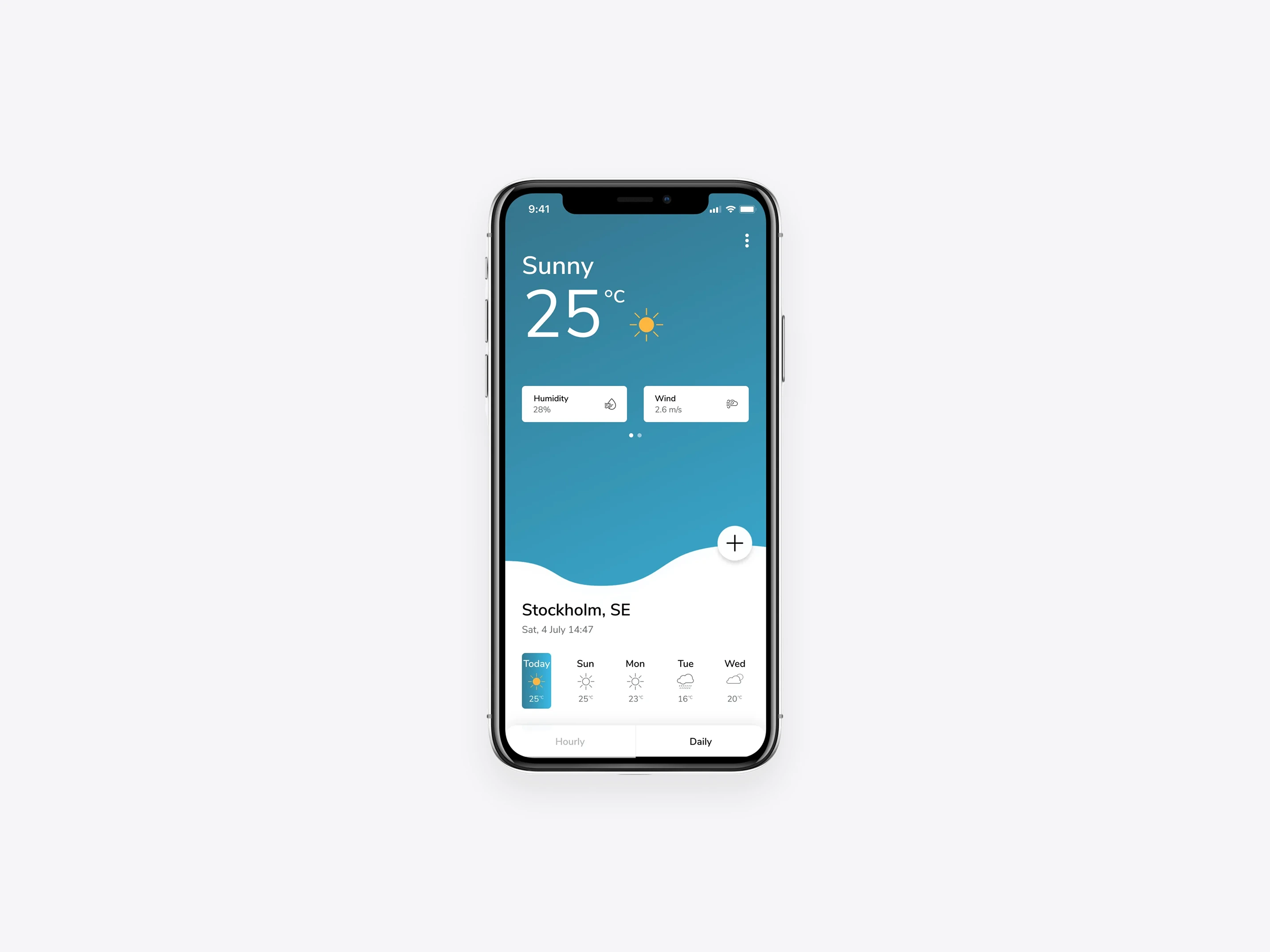
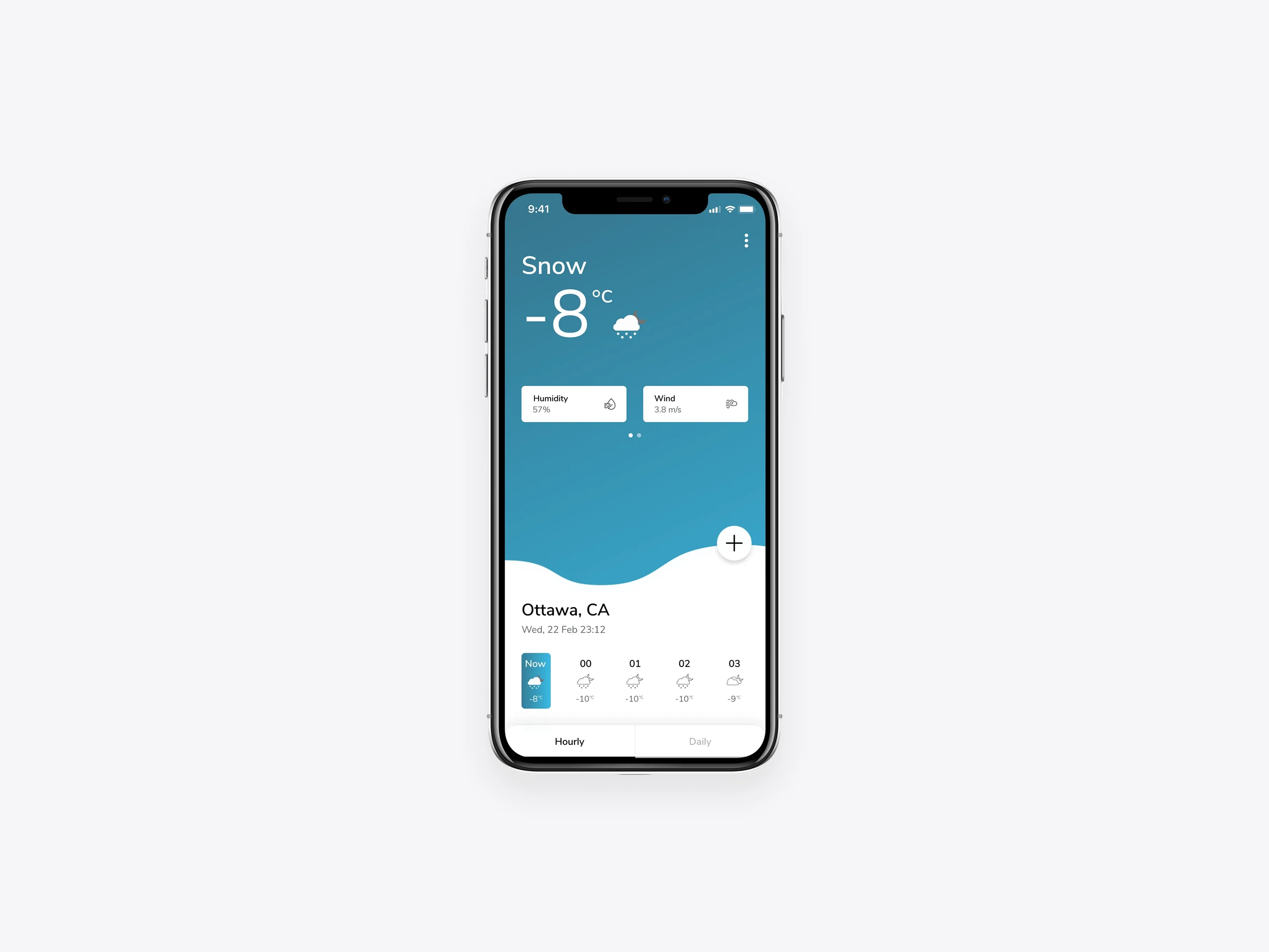
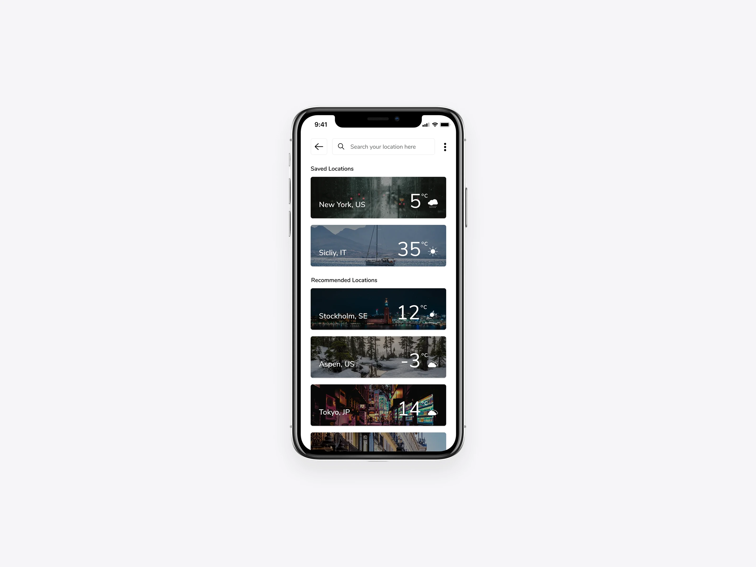
Geosty is a mobile weather application designed to deliver clear and reliable weather information based on the user’s current location. The app provides current conditions alongside hourly and daily forecasts, including key details such as humidity and wind.
The project was created as a personal initiative, with a focus on exploring visual clarity, information hierarchy, and intuitive interaction patterns within a familiar product category.
Role
I designed Geosty end-to-end, covering UX design, visual design, and interaction patterns. The work included defining the information structure, designing core weather views, and establishing a clean visual language to support quick comprehension for iOS.
As a self-initiated project, Geosty allowed for full creative ownership and experimentation with layout, color, and interaction decisions.
02 The
challenge
Presenting dense information in a lightweight experience
Weather apps often present large amounts of data that can feel overwhelming on mobile. The key challenge was simplifying information without removing what users need — ensuring the experience remains fast to scan and easy to understand.
Another challenge was designing a visual system that feels calm and consistent across varying weather conditions and UI states.

03
Approach
Designing for glanceability and clarity
The design approach focused on hierarchy and contrast. Information was grouped and prioritized to support fast scanning, while subtle visual cues helped guide attention to the most important data points.
A fresh blue gradient palette was used to reinforce the weather context, complemented by neutral tones to maintain balance and avoid visual noise. Interaction patterns were kept minimal to ensure the content remained the primary focus.
04
Outcomes & learnings
Refining clarity through visual hierarchy
Geosty resulted in a lightweight and focused weather experience that emphasizes clarity over complexity. The project reinforced the importance of strong hierarchy, restrained use of color, and designing for real-world usage scenarios where users often interact briefly and repeatedly.
Working without external constraints also provided valuable insight into balancing visual exploration with usability fundamentals.
Related work
More to explore
A selection of related projects focused on clarity, structure, and purposeful design across different industries.